The Advert That Actually Worked
Thursday August 10, 2023

Picture this: It's a warm, wet evening (yep, still raining!) and I've just settled into my favourite armchair for 5 minutes' rest while the kids read in bed.
I'm casually flipping through the latest edition of 'InPublishing' magazine which arrived in the post earlier that morning, whilst keeping an ear out for over-excited antics on the floor above.
I like InPublishing. For a magazine publisher like me, it keeps me up to date with things that are happening in our industry.
Nothing unusual so far. Well, nothing other than the fact I actually managed to stop for 5 minutes, anyway.
Then it happened.
Nestled between articles on industry trends and insights was an advert that didn't just catch my attention—it held it.
Then – crucially – I got out my phone and emailed the company.
I had taken action because of an advert.
The holy – and incredibly elusive – grail of marketing had happened to me!
And it made me think – WHY had that advert worked on me, when so many others had failed?
Like you, I've built up an impressive immunity to advertising.
Most adverts flutter past our eyes with little more than a cursory glance, our built-in marketing filters working on overtime to stop us wasting our precious time and attention.
So how had this advert got through my (very impressive) natural defences?
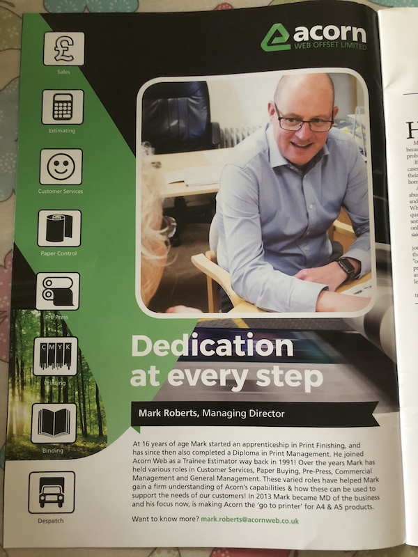
This was the advert:


It’s an advert for the kind of printer that we would use to churn out the pages of the Toddle About magazine. So, first and foremost, they are relevant to me.
Not a surprise, I suppose, given that the magazine I’m reading is for publishers.
So… Lesson 1: Know where your target audience hangs out and advertise there.
But there were lots of other adverts in this magazine to which I hadn’t responded… so it was more than just advertising in the right place.
Let’s dig in a bit further…
It might be stating the obvious, but it’s a full page advert – so I couldn’t really miss it. So that helped.
Lesson 2: Size does matter (when it comes to advertising!)
Now, let’s think about the design - which is where it starts to get really interesting.
You see, the layout of the advert isn’t particularly different or amazing. But the content is.
The advert doesn’t talk about how big their printing press is (like everyone else does). And it doesn’t tell me how amazing their company is (like everyone else does).
It just tells me about their Managing Director – Mark.
Rather than bombarding me with technical specs or deals, this ad tells me Mark’s story. It paints a portrait of their Managing Director—an everyday individual who has worked his way up to the top. Someone who knows his stuff.
This genuine touch resonated. It whispered, "We are people, just like you. And we really know a lot about printing."
Lesson 3: Be authentic. Show who YOU are. Because people connect with people, not faceless brands.
And it doesn’t stop there!
When it comes to finding out more – or the ‘Call to Action’ as us marketers call it - the advert doesn’t give me their website address, or social media channels.
In fact, all it does is give Mark’s email address.
Ordinarily, this would be a bit of a no-no. But in this case, it’s genius.
You see, printers are a bit of a commodity in our industry – by which I mean, they’re all very much the same, providing the same service. So, in the end, they can only really compete on price.
So I don’t need to see their website. I already know what they do and what it will tell me.
Really, I want to know how much they would charge to print my magazines – and emailing them is a great way to do that.
But they haven’t just given me an “info@” address, or some salesperson. They’ve given me the Managing Director’s email address!
It makes me feel like, you know what? Mark actually cares about his customers.
And as a customer, I really want to feel like I’m important to my suppliers. So this worked a treat!
Plus, they’ve already told me who Mark is, so I feel I know him a bit, and I feel comfortable emailing him.
Maybe they're not the same as all the others, after all...
Lesson 3: Be different to your competition. Show you care. Go the extra mile.
Finally – the thing that tipped me over the edge and got me to actually take action, was one line towards the end:
The ad tells me that Mark’s focus is “making Acorn the ‘go to printer’ for A4 and A5 products”.
If I had any doubt before that Mark could help me, this eliminated it. It basically told me that they are experts in printing A5 products – and I publish an A5 magazine!
So, Lesson 4: Be clear about the niche you serve and tell everyone what that is.
If you try to be everything to everyone, you’ll end up being nothing to no one.
Your marketing won’t connect with people, and you’ll be left wondering why your adverts don’t work.
So it isn’t just one thing you have to get right for your adverts to work … it’s lots of little things, all combined.
I know it’s a bit of a minefield, which is why I’m sharing these thoughts with you. And if you ever want my help - just email me! I'd be happy to critique your advert design or brainstorm some ideas.
Till next time,
Tim
PS. In case you were wondering, I received a reply from Mark the morning after I sent my email. A couple of hours later, one of his account managers called me to discuss our job and, again, made me feel like they really cared and really knew their stuff.
I’m currently awaiting their quote, but they’ve really impressed me so far… and I still haven’t looked at their website!