How to turn £200 into £7,000
Tuesday June 6, 2023

A few years ago, one of our advertisers wrote to me to tell me that, regretfully, they were going to have to cancel their advert.
They just weren’t getting enough responses and bookings to justify their investment.
I was gutted.
Not because we were losing an advertiser, though that hurt.
I was upset because I knew, with certainty, that Toddle About was the right place for her to advertise.
She ran a photography business specialising in baby and family photography.
Our readers were a PERFECT fit for her business.
Other advertisers were getting a great response, so I felt that she should’ve been getting a good response too.
She agreed to jump on a call to discuss things, and it quickly became apparent that she instinctively felt the same way.
She was a mum, and she herself used the Toddle About magazine, referring to it time and again to find things to do with her little ones.
She knew that her friends were doing the same thing.
So… If thousands of her ideal prospects were seeing her advert, why weren’t they responding to it?
We looked at her advert together, and everything fell into place.
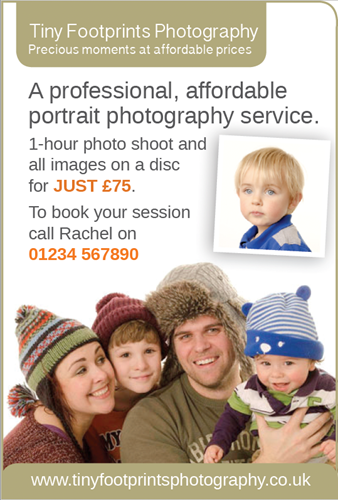
This is what it looked like (details have been changed for privacy):

Not a bad advert. But not good enough.
She was a smart businesswoman, and she agreed to take a chance and have another go.
Not only that, but she UPGRADED her advert to a bigger size, and paid for our advert design service to produce something that would work better.
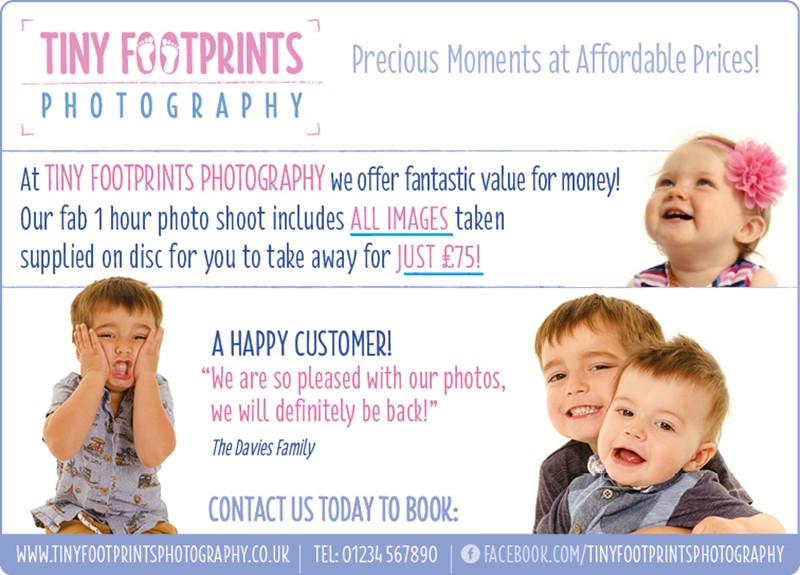
This is what we created:

Just a couple of weeks after the new advert went out, she wrote to me to say this:
“I just wanted to drop you a quick note to let you know that the response from this edition’s advert has been brilliant. Looks like the upgrade has definitely paid off, I have never been busier in January! I'm looking forward to continuing with the slot.”
Needless to say, I was delighted.
Not only had we turned things around for her, but we had done it January - which was normally the quietest month of the year for her.
The question here is: Can you see what we did differently?
Could you use the lessons in this advert transformation to improve the responses from your own adverts?
Here are the things that we did:
- We increased the size of her advert
As a photographer, she needed to be able to show off to work. She also needed more space to get her message across. And we knew that a bigger advert would attract more eyeballs. - We designed a proper logo
People need to trust you in order to spend money with you. At a subconscious level, a professional and appropriate logo gives your prospects confidence that you know what you are doing.
- We picked the right headline
She was already using the slogan, “Precious Moments at Affordable Prices” – but it wasn’t the headline. Yet it made a brilliant one. “Precious Moments” connects with the reader on an emotional level, and “At Affordable Prices” answered her key objection (Price) straight away. - Rephrased the body copy
By changing just a few things in her text, we were able to convey the value she offered to her customers in a much more effective way. - Included Social Proof
By adding in a testimonial from one of her customers, we provided the reader with social proof. Including testimonials in your advertising is SO powerful because it’s like getting a recommendation from a friend. It isn’t you saying you’re wonderful – it is someone like them. - We made it look and feel fun and high quality
We took time to choose the right colours and fonts, that would convey her sense of fun, whilst also choosing images that backed that up and demonstrated the quality that she offered. Clever use of ‘white space’ makes the advert easy to read in a way that ‘flows’ nicely.
The Return on Investment
This advert cost our advertiser a little over £200.
She brought in at least 15 new customers because of it – and most of them didn’t just take the images from their shoot.
They bought prints worth hundreds of pounds – spending, on average, about £500 each.
That brings her return on investment to over £7,000.
And that doesn’t include the additional revenue she would get when those new customers recommended her to their friends.
So… is your advert working as hard for you as it could?
Fancy trying your advert design skills on an advert in the Toddle About Magazine?